Rethinking Patient Experience Through Design
Luci Leykum, MD, MBA, MSc
Healthcare systems use analytic, data driven, evidence-based approaches to solve problems with human health, yet many of the challenges in healthcare are not easily defined or analyzed. As a result, the humanistic portion of healthcare is consumed by the system’s priority to be efficient, and patient experience may suffer. We brought a design-thinking perspective to create more patient-responsive hospital care, allowing patient stories to drive the creation of a human-centered experience.
We sought to explore patients’ experiences of hospitalization from a design thinking perspective. As part of an ongoing collaborative care implementation, we interviewed 45 patients over 3 months, asking about their needs, communication, family involvement, and understanding of the care plan. Patients were identified by a case manager based on cognitive function, acuity of illness, and English fluency. Interviews were audio-recorded and transcribed. We adopted the design thinking method from IDEO, an international design firm, and coded interviews for unmet expectations, workarounds, tensions, problems, and needs. We aggregated responses with similar content into themes that allowed us to identify opportunities for innovation.
Here’s what we learned:
- Patients do not have a clear understanding of the care plan throughout their stay.
- Patients were confused by the various healthcare professional roles and responsibilities.
- Patients frequently rely on family and friends as surrogate informal caregivers, yet these individuals are rarely included in the care team.
- Medication reconciliation can be inaccurate, leaving patients to verify these recommendations.
- Patients have difficulty understanding health care terms, and this often goes unnoticed.
- There are many gaps in healthcare management before, during, and after discharge.
- Patients don’t fully understand cost of care and access to services.

Here is a glimpse at the two problems we tackled and the prototypes we are piloting:
Patients do not have a clear understanding of the care plan throughout their stay.
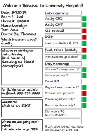
 Patients and family members were confused about the care plan for the day. They were overwhelmed by the number of people asking the same questions every morning. Patients kept lists at the bedside to keep track of the tasks for that day, and many family members had to video-record the doctors while the plan was discussed to re-watch and try to understand later.
To improve the clarity about the care plan and encourage transparent communication, we replaced the existing whiteboard and safety checklist with a prototype that outlined the steps that needed to be completed that day (see figure 1). The whiteboard is analogous to a stoplight on the road. Each task has a magnet next to it that can be flipped from red to green once it’s complete. The tasks are addressed with nursing throughout the day and with the physician team during rounds. Patients and family can also update tasks as they are completed to encourage engagement in the treatment plan.
Patients were confused by the various healthcare professional roles and responsibilities.
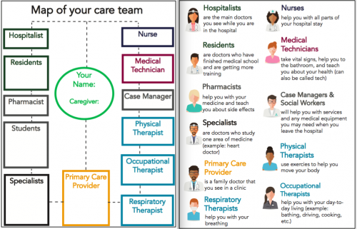
Imagine, you are admitted to the hospital. You meet around 15 different care team members with various roles. Now imagine that each of their shifts change at different times. Our patients struggled to keep up with the roles and responsibilities of everyone on their care team and were routinely tasked with coordinating communication between care team members.
We designed a bedside map of the care team to empower patients to engage with and keep track of their team (see figure 2). There is space for patients to write the names of the team members along with definitions of each role on the back.

Initial Results & Next Steps
In design, we started with small scale, inexpensive prototypes to quickly assess the feasibility and viability of our proposed solution. Could we remove the existing whiteboard in patients’ room and replace it with something entirely different? Could patients easily interact with our models to better understand their care journey and care team? Both prototypes allowed us to learn valuable information about the behavior of patients and the care team staff.
Our first round of pilots is complete, and we are gathering feedback from patients and staff. Thus far, patients report ease in understanding their care plan with the new whiteboard during nursing rounds. Patients are also consistently engaging with the bedside map of the care team and feel confident knowing the roles of the members on their care team. We’ve learned important insights about how to improve our models by observing how the current prototypes are being used. For instance, patients are asking nurses to write the cafeteria phone number and the time that the last pain medicine dose was given onto the whiteboard. One patient said that the new whiteboard and map of care team “change the way I communicate with doctors. I feel much more confident in my interactions because I know what to ask.” We are continuing to understand our patients’ priorities and discovering ways to improve patient-responsive care.
We used feedback from patients and staff to create the next iteration of our prototypes, and we are currently testing it. Once we finish making changes to our models, we will work alongside the hospital’s Chief Operational Excellence Office to scale our work across the hospital.
Lessons learned:
We learned that design is more than a method to improve patient experience. Design is a process of discovery about the system we are trying to change.
Challenging legacy behavior isn’t easy.
- Any time you hear that you can’t change something, find the courage to ask why. We found that there was not always a great reason why we have always done something the same way in healthcare.
- Test prototypes early, quickly, and on a small scale. If you invest too much time and resources into an idea before you test it, you are less likely to start from scratch if it doesn’t work. Change happens as a result of trying something different, learning from failures, and being willing to try again.
- At first we felt silly requesting such a small budget from hospital leadership for our first round of prototypes. Bottom line? More spending does not always equal more results.
- Don’t underestimate what you can learn by observation. Our most meaningful insights came from simply watching how patients interacted with their environment to better understand how to help them.
- Our interventions were widely supported and implemented because we started with what patients care about and involved members of the healthcare team to create the change they wanted to see.


